When I first started learning how to write markup using HTML and CSS, it took some time to actually wrap my mind around the differences between margin and padding in the box model. In this article, I will share how I was finally able to differentiate between the two.
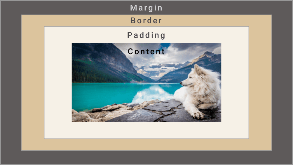
When talking about margin and padding, it’s best to review how the CSS box model works. Think of the box model – the containers we put the components of our website in – as a picture that has been placed in a picture frame:

The content is the picture itself – that thing we want to put in the container. Just surrounding it is the padding.
If we were in a frame store, the padding would be the matting, which leads to the need for a larger picture frame. When we add padding in CSS, we essentially push out our content box to make the container bigger. Padding is the space in between the content and the border.
Next comes the border – it is essentially the frame that holds our content and padding. The margin is the space between the adjacent elements (our picture frames) on our viewport (the wall).
So the question becomes: when should we use margin and when should we use padding?
Some might say the answer to this is a little subjective, but in general it’s a good idea to use CSS margins if we want to adjust how an element looks in relation to other elements on the page. Padding should be used when we want the space around the content to be bigger.
Setting Margin and Padding
<!DOCTYPE html>
<html lang="en">
   <head>
       <meta charset="UTF-8" />
       <meta name="viewport" content="width=device-width, initial-scale=1.0" />
       <title>Margin vs Padding</title>
   </head>
   <style>
       body {
           background: darkslategray;
           width: 100%;
           height: 100vh;
           max-width: 800px;
           display: flex;
           margin: 0 auto;
           justify-content: space-evenly;
           align-items: center;
       }
       #star-wars {
           background: ivory;
           border: 20px solid cyan;
       }
       #lotr {
           background: ivory;
           border: 20px solid green;
       }
   </style>
   <body>
       <div id="star-wars">
           <h3>Star Wars Chars</h3>
           <div>
               <p>Hans Solo</p>
               <p>Luke Skywalker</p>
               <p>Obi Wan Kenobi</p>
               <p>Chewbacca</p>
               <p>R2D2</p>
               <p>C3PO</p>
           </div>
       </div>
       <div id="lotr">
           <h3>Lord of the Rings Chars</h3>
           <div>
               <p>Bilbo</p>
               <p>Gandalf</p>
               <p>Frodo</p>
               <p>Sam</p>
               <p>Legolas</p>
               <p>Aragorn</p>
           </div>
       </div>
   </body>
</html>
In the code editor above, two boxes with basic backgrounds, content and borders are set. Imagine a scenario where you want the padding and the margins to be different on every side. In the <style> tag, try using different sizes on all sides, like so:
 #star-wars {
           background: ivory;
           border: 20px solid cyan;
           margin-top: 10px;
           margin-bottom: 30px;
           margin-left: 5px;
           margin-right: 25px;
           padding-top: 20px;
           padding-right: 25px;
           padding-bottom: 35px;
           padding-left: 45px;

       }
       #lotr {
           background: ivory;
           border: 20px solid green;
           margin-top: 10px;
           margin-bottom: 30px;
           margin-left: 5px;
           margin-right: 25px;
           padding-top: 20px;
           padding-right: 25px;
           padding-bottom: 35px;
           padding-left: 45px;

       }
That being said, there is a shorthand you can use: margin: 10px 25px 30px 5px; the numbers are in trouble (TRBL): top, right, bottom and left! This is the order you will find not only margin and padding, but pretty much any property that uses shorthand to describe the sides of your box.
Most likely, you will have a scenario where the top and bottom margins/padding will be the same and the left and right margins will be the same. If that happens, you can use a shortcut:
 #star-wars {
           background: ivory;
           border: 20px solid cyan;
           margin: 20px 30px;
           padding: 30px 20px;
       }
       #lotr {
           background: ivory;
           border: 20px solid green;
           margin: 20px 30px;
           padding: 30px 20px;
The first number is the top and bottom margin/padding and the second number is the left and right margin/padding.
If all the sides are going to be the same, you can just simply say padding: 30px; or margin: 30px;
Conclusion
In this article, we reviewed aspects of the box model and discussed how margin and padding differ. Remember that margin deals with the space outside the border and padding deals with the space inside the border. Keep playing with the margins and paddings of the containers in the code editor above and you’ll be a master at setting margins and paddings in no time.
About us: Career Karma is a platform designed to help job seekers find, research, and connect with job training programs to advance their careers. Learn about the CK publication.


