Navigation bars are an important part of any web site. They make it easy for users to find pages on a web site, which increases the chance that a user is able to find the content that they are looking for on the site.
By default, navigation bars in HTML are plain. However, you can use CSS to style a navigation bar and make it both aesthetically pleasing and easier to view.
This tutorial will discuss, with examples, how to create a navigation bar in HTML and how to style a navigation bar using CSS.
Navigation Bar Structure
A navigation bar is a list of links in HTML. Before we can style a navigation bar using CSS, we need to define an HTML list with the links we want to include in our navigation bar.
To create our list of links, we are going to use the <ul> and <li> elements. The <ul> HTML element is used to create an unordered list—a list with bullet points—and the <li> element is used to add an item to our list.
Throughout this article, we are going to use this example to illustrate how to style our navigation bar: We have been asked by a local fishing club to create a website that displays information about their club. The club wants their site to have a navigation bar which makes it easy for users to explore the site.
We could use the following HTML code to create our navigation bar:
<ul>
	<li><a href="index.html">Home</a></li>
	<li><a href="members.html">Members</a></li>
	<li><a href="fish.html">Fish</a></li>
	<li><a href="join.html">Join</a></li>
</ul>
Our list contains four links, each of which point to different pages on our site. Right now, though, our navigation bar is just a list. We need to use CSS to style our list and turn it into a full navigation bar.
First, we are going to remove a few default settings for our navigation bar. The following CSS code is used to remove the bullet points, margins, and padding from our list. We don’t need these to create our navigation bar.
ul {
		list-style-type: none;
		margin: 0;
		padding: 0;
}
The list-style-type: none; property removes the bullet points, and the margin: 0 and padding: 0 properties remove the margin and padding for our navigation bar, respectively. We will use these styles in all of our examples below.
Here’s what our navigation bar looks like so far:

Right now, our navigation bar is plain, but we can use other HTML styles to make the element more interesting and visually appealing.
Vertical Navigation Bar
Often, you’ll want to create a navigation bar that appears vertically on a screen. This approach is common if you are creating a reference site whose navigation bar needs to contain a large number of values.
To create a vertical navigation bar, you should style the a elements inside the navigation bar. Suppose our fishing club wants each link to appear in green. We could accomplish this using the following code:
li a {
	display: block;
	width: 50px;
	color: green;
}
Our code returns:
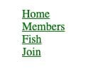
Let’s break down our code:
- The display: block property is used to allow the user to click around the link to trigger the link (so, the user doesn’t have to directly click the link).
- The width: 50px property sets the width of each link to be 50px wide. By default, the width of a link takes up the entire space of its parent component.
- The color: green property sets the color of the text in our navigation bar to green.
The fishing club has changed their mind and wants to have a navigation bar with a light gray background and green text. The club also wants each element in the navigation bar to turn gray if the user hovers over an item in the navigation bar. We could create this navigation bar using the following code:
ul {
	list-style-type: none;
	margin: 0;
	padding: 0;
	width: 200px;
	background-color: lightgray;
}

li a {
	display: block;
	color: green:
	padding: 20px;
	text-decoration: none;
}

li a:hover {
	background-color: gray;
}
Our code returns:
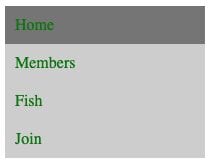
Let’s break down our code. In our code, we used:
- The background-color: lightgray; property to set the background color of the navigation bar to light gray.
- The padding: 20px; property to set a padding of 20px around each link.
- The color: green; property to make each link appear in green.
- The text-decoration: none; property to remove the underlines from our links.
- An a:hover tag to change the color of a link to gray when the user hovers their cursor over the link.
This is just one example of how to style a vertical navigation bar in CSS. You could use any CSS style to change the vertical navigation bar to meet your specific needs.
Center Links
When you’re designing a vertical navigation bar, you may decide that you want to center the links in the component. You can do so using the text-align: center; property.
Here’s an example of text-align: center; being used to center the links in a navigation bar:
li a {
	text-align: center;
}
Our code returns:
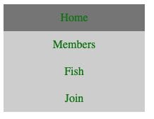
We reuse the code from our earlier example in this illustration. However, in the above example we also used the text-align: center; property to center the text in our navigation bar.
Active Links
You may want to create an active class which you can use to tell the user which page they are on.
The fishing club has contacted us and asked if we can add a green background to a navigation item when a user is viewing a specific page on the website. So, if a user is viewing the “Home” page, the navigation item for “Home” should change.

"Career Karma entered my life when I needed it most and quickly helped me match with a bootcamp. Two months after graduating, I found my dream job that aligned with my values and goals in life!"
Venus, Software Engineer at Rockbot
We could use the following code to accomplish this task:
.active {
	background-color: green;
	color: white;
}
Our code returns:
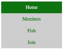
In our example, we applied the active class to the first <a> tag in our list. This allows us to show the user what page they are on in the navigation bar.
Fixed Vertical Navigation Bar
Vertical navigation bars often span the height of the page and are fixed to the side of the page. These navigation bars are often referred to as sticky, because they are stuck to a certain position on the page.
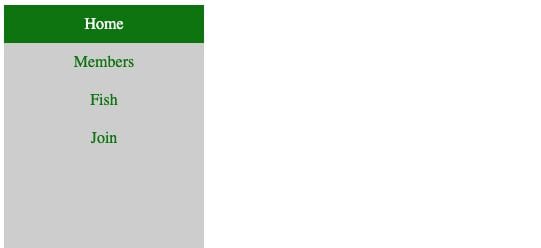
Suppose we wanted to create a navigation bar for the fishing club which sticks to the side of the page. We could use the following code, in addition to the code from our previous example, to do so:
ul {
	height: 100%;
	position: fixed;
	overflow: auto;
}
Our code returns:
In this example, we:
- Use the height: 100% property to set the height of our navigation bar to be equal to the height of the page.
- Set
positiontofixed, which makes our navigation bar stick to a certain position on the page. - Use the overflow: auto; property to enable scrolling in the sidebar if there is too much content on the page.
Our code returned a vertical navigation bar that is fixed to the side of our web page.
Horizontal Navigation Bar
There are two ways you can create a horizontal navigation bar in CSS. You can either assign the display: inline property to a list of links, or use the float: left property.
Inline Property
To create a horizontal navigation bar, you can set each <li> element to be displayed inline in your code. Here’s the code you would use to do so:
li { display: inline; }
This code removes the line breaks before and after each item, which means they will all be displayed on one line.
Float Property
Alternatively, you can float each of the <li> elements in a list to the left. Then, you can create a layout for each link in the list. Here’s the code you would use:
li { float: left; }

a {
	display: block;
	padding: 10px;
}
In this example, we use float: left to make all <li> elements in our list appear next to each other. Then, we use display: block to make the whole link area in our <a> tags clickable, rather than just the text. We also use padding: 10px to create a 10px padding around each link, which makes our links easier to read.
Now we know the basics of styling a horizontal navigation bar, we can start exploring a few examples.
Horizontal Navigation Bar Examples
The local fishing club has asked us to create a horizontal navigation bar so they can see how it would look in comparison to a vertical navigation bar.
The club wants the navigation bar to have a light gray background, and for each item in the list to turn dark gray when a user hovers over an element. We could use the following code to create this navigation bar:
ul {
	list-style-type: none;
	margin: 0;
	padding: 0;
	overflow: hidden;
	background-color: lightgray;
}

li { float: left; }

li a {
	display: block;
	color: black;
	padding: 10px;
	text-decoration: none;
}

li a:hover {
	background-color: gray;
}
Our code returns:

Let’s break down our code. In our code, we have created a navigation bar with a light gray background. We used the float: left; technique to make our links appear horizontally. Then, we:
- Created a 10px padding around each link
- Removed the link underlines using the text-decoration: none
- Displayed each link using the block style (so the area around each link is clickable, in addition to the text contained within the link)
- Set the color of the text in each navigation item to black.
We also used the a:hover style to set the background color of each item in our navigation bar to dark gray when the user is hovering over a link.
Align Links to the Right
By default, the links in our navigation bar appear at the left of the element. However, if we want to align a link to the right, we can do so using the float: right; property in our code.
Here’s the CSS code we would use to float a link to the right:
.floatRight {
	float: right;
}
When we apply the floatRight class to the last <li> tag in our navigation bar, the following navigation bar is created:

In this example, the Join link—which is the last item in our navigation bar—has been aligned to the right of the navigation bar.
Active Links
We can use the active class that we created earlier to create an active navigation link.
Suppose we want to change the background color of each link to black, and the color of the link’s text to white when a user is on a certain page. We could use the following style to accomplish this task:
.active {
	background-color: green;
	color: white;
}
Our code returns:

We have applied the active class to the first element in our list. As you can see, the Home link now has a green background and its text has changed to appear in white.
Fixed Horizontal Navigation Bar
Often, when you’re designing a horizontal navigation bar, you’ll want the navigation bar to stick to the top or the bottom of the page. You can accomplish this task using the position: fixed; CSS property.
The local fishing club would like to see the navigation bar presented at both the top and bottom of a web page. Here’s the code we would use to show the navigation bar at the top of the page:
ul {
	position: fixed;
	top: 0;
	width: 100%;
}
This code fixes our navigation bar to the top of the page, and returns the following:

In our code, we used the position: fixed; and top: 0; properties to fix our navigation bar to the top of the page. If we wanted to fix our navigation bar to the bottom of the page, we could use this code:
ul {
	position: fixed;
	bottom: 0;
	width: 100%;
}
Our code returns:
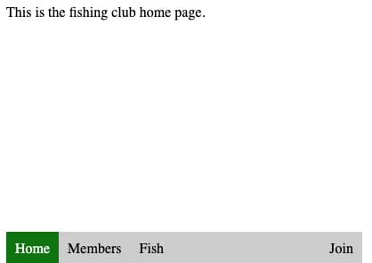
You can see that, in this example, our navigation bar appears at the bottom of the page.
Conclusion
CSS can be used to create a styled navigation bar from a list of HTML links.
This tutorial discussed, with reference to examples, how to create a navigation bar in HTML, and how to style the navigation bar using CSS. Now you’re ready to start designing your own navigation bars with HTML and CSS like a professional!
About us: Career Karma is a platform designed to help job seekers find, research, and connect with job training programs to advance their careers. Learn about the CK publication.


