The CSS Flexbox Model was created to improve the established CSS Box Model. The Flexbox Model still contains the major elements of the Box Model (margin, padding, border and content), but offers flexibility to best fill the space with the container’s/parent’s children.
This tutorial will help you to understand the flexbox module a bit better so you can start to make your sites more responsive.
The following is starter code for a basic flexbox model demonstration – please follow along as we talk about flexbox!
<!DOCTYPE html>
  <head>
    <title>Flexbox</title>
    <style>
       * {
        	box-sizing: border-box;
        	font-family: 'Roboto'
       }
      .parent-container {
        	height: 700px;
        	background: green;
        	width: 700px;
        	padding: 20px;
      }
      .child-item {
        	height: 200px;
        	width: 200px;
        	margin: 0px;
        	padding: 20px;
      }
      .child-item:first-child {
        background: orange;
      }

      .child-item.one {
        background: purple;
      }
      .child-item.two {
        background: aliceblue;
      }
      .child-item.three {
        background: grey;
      }
      .child-item.four {
        background: pink;
      }
      .child-item.five {
        background: yellowgreen;
      }
      .child-item.six {
        background: red;
      }
      .child-item.seven {
        background: blanchedalmond;
      }
      .child-item.eight {
        background: white;
      }
      .child-item.nine {
        background: lightblue;
      }
      .child-item.nine {
        background: darkred;
      }
      .child-item:last-child {
        background: yellow;
      }

	</style>
 </head>
 <body>
  	<div class="parent-container">
		<div class="child-item">Lisa Simpson</div>
        	<div class="child-item one">Bart Simpson</div>
        	<div class="child-item two">Maggie Simpson</div>
        	<div class="child-item three">Homer Simpson</div>
        	<div class="child-item four">Marge Simpson</div>
        	<div class="child-item five">Grampa Simpson</div>
        	<div class="child-item six">Santa's Little Helper</div>
        	<div class="child-item seven">Apu Nahasapeemapetilon</div>
        	<div class="child-item eight">Moe Szyslak</div>
        	<div class="child-item nine">Ned Flanders</div>
        	<div class="child-item ten">Snowball II</div>
    </div>

	<script src="" async defer></script>
 </body>
</html>
Parent Container (Flexbox) Properties
display: flex
The display property has several values we can use to position our containers on the screen. You may have seen block, inline-block, none, hidden, inline already, but the one we are going to focus on right now is called flex.
First, what I would like you to do is envision a large container – a treasure chest, a toy box or a cardboard box – and then imagine putting items inside the container. The large container is what we call the parent or flexbox and the smaller items that go inside the container are the children or flex items.
When we add display:flex to a parent container, the property is assigned to that container and that container alone – the children do not inherit the property (however, they can use the property for their own containers that will affect their children).
This property opens all kinds of other properties we can use that we were not able to before: flex-direction, justify-content, align-items, align-self, flex-wrap and flex-flow.
Run the code editor above. Right now, you should see a large green container, the parent container, and 11 smaller containers, the child containers, inside the parent.
The orientation of the child containers are on top of each other because the default is display: block. If you recall, when we use display: block, the container takes up the entire row it’s in. The margin’s default expands to the width of the parent container, resulting in both child containers being on top of each other.
In contrast, using display: flex allows us to easily position the child containers any way we like in the parent container without having to use older box model properties like float and vertical-align.
Try adding display: flex to the CSS in the style tag in the code editor so that the parent container’s CSS looks like this:
.parent-container {
height: 700px;
background: green;
width: 700px;
padding: 20px;
display: flex;
Adding display: flex to the .parent-container will result in a change to the orientation of the child containers. Once you hit , you should now see the child containers side-by-side.
By using display: flex instead of display: block, the default margin is set to 0. We can then manipulate it however we see fit!
flex-direction
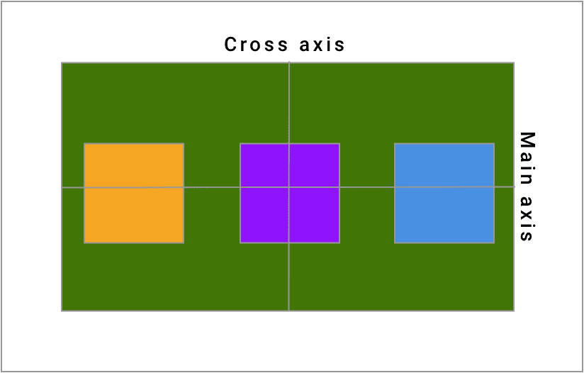
The flex-direction property sets up the main axis of our container. The default setting in the flex container is row. When setting up the parent container with display:flex, there is no need to establish a flex-direction unless you need your content to be in a column.
The main axis in the default direction is left to right and the cross axis is top to bottom, as seen here:
Let’s try adding flex-direction: column to our .parent-container in the code editor above. What happens when you press?
It seems to be that the axes flip when we switch flex-direction to column: what was our main axis becomes the cross axis and then what was our cross axis becomes the main axis, as illustrated below:
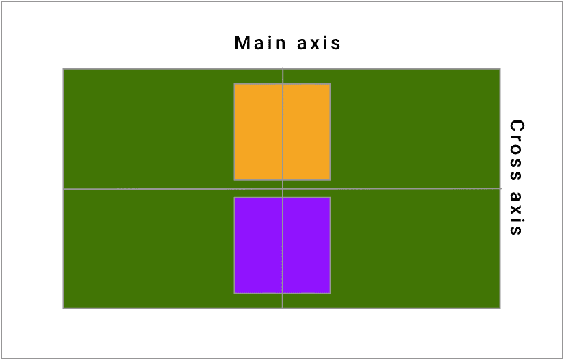
As a result, our children containers in our example flipped their axes! So now the child containers are once again on top of each other.
The biggest thing to remember about flex-direction is that the direction of the main axis corresponds to the value of your flex-direction property (column is top to bottom, row is left to right).
Justify-content concerns itself with the spacing on the main axis and align-items concerns itself with spacing around the cross axis. We’ll get into those properties a little later.
There are two other possibilities for flex-direction: row-reverse and column-reverse. These properties are very similar to row and column, but the flex-items are laid in a reverse order, right to left, in the case of row-reverse, and bottom to top for column-reverse.
The use case for these particular values comes when you need to have a different layout or order on your page from web to mobile or tablet.
flex-wrap
So far we have learned how display: flex affects a parent’s child containers and then how to manipulate the flow of those child containers in a row or in a column. What if the size of the parent runs out of room? What happens? And how can we fix it?
The answer comes in the form of the property called flex-wrap. By default, flex-wrap is set to nowrap. This means that the child containers can overflow the parent container, causing unwanted layout problems. Let’s try adding flex-wrap: wrap; to the .parent-container and see what happens:
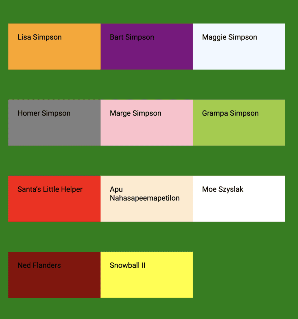
The layout of the container here looks much nicer. Flex-wrap will take all the children components, lay them side by side until it hits the width of the parent container and then move to the next row to add more child containers to repeat the process until all of the containers have been displayed.
Flex-wrap has three available properties: nowrap, wrap and wrap-reverse. wrap-reverse is the same as wrap except that it flows bottom to top instead of top to bottom.

"Career Karma entered my life when I needed it most and quickly helped me match with a bootcamp. Two months after graduating, I found my dream job that aligned with my values and goals in life!"
Venus, Software Engineer at Rockbot
flex-flow
Flex-flow is shorthand for flex-direction and flex-wrap. The syntax is flex-flow: column wrap if you would like your flex-direction to be column and your flex-wrap to be wrap. flex-flow: row nowrap is the default value.
justify-content
The justify content property is concerned with alignment along the main axis of the parent container. It helps to distribute your flex-items across the main axis without you having to calculate the space needed. The six most commonly used property values for justify-content are flex-start (the default), flex-end, center, space-around, space-between and space-evenly.
flex-start:
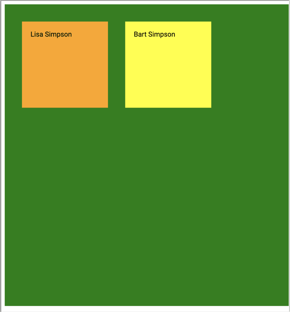
justify-content: flex-start is the default setting for this property. All the child containers/flex-items observe margin and padding, but congregate towards the start of the main axis. flex-end:
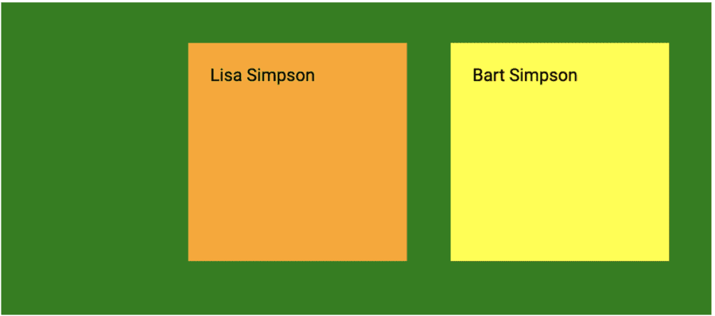
justify-content: flex-end – All the child containers/flex-items observe margin and padding, but congregate towards the end of the main axis. center:

justify-content: center – All the child containers/flex-items observe margin and padding, but congregate towards the center of the main axis. space-around:
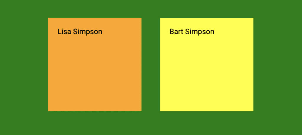
justify-content: space-around – All the child containers/flex-items observe margin and padding, but they also have equal space on either side of each individual container. space-between:
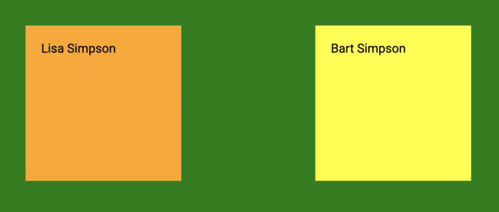
justify-content: space-between – All the child containers/flex-items observe margin and padding. The first container and the last container are at either end of the container with the rest of the containers distributed in between. space-evenly:
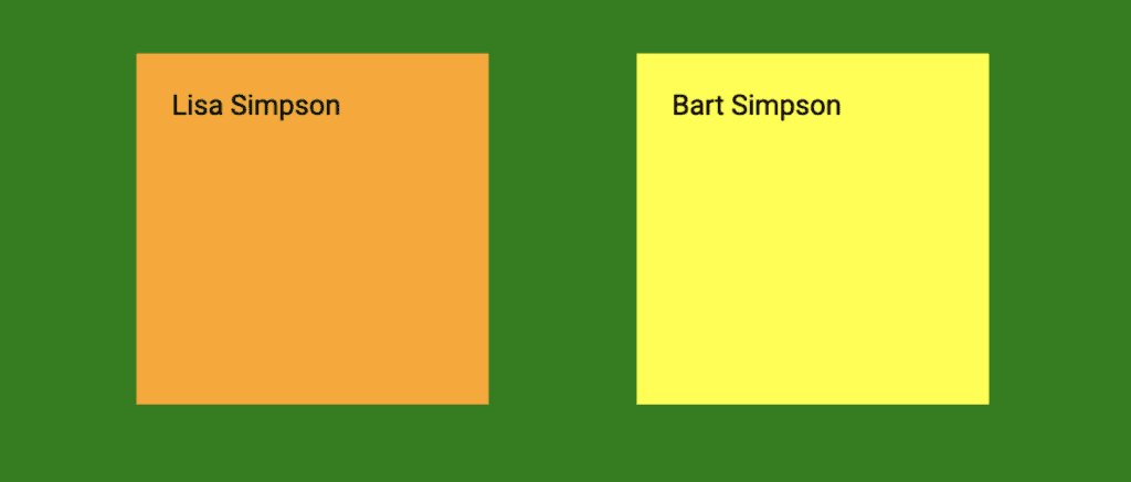
justify-content: space-evenly – All the child containers/flex-items have equal space between all child containers as well as between containers and edges. align-items
The biggest difference between align-items and justify-content, besides the axis it distributes the child containers on, is its default value. As a reminder, when we use flex-direction the default value for justify-content is flex-start. That is not the case for align-items. Instead, the default value is stretch.
To illustrate, let’s go back to the code editor at the top of the page and take out the width and height on the .child-container. We already have display: flex and flex-direction set. Let’s toggle between flex-direction: row and flex-direction: column to see how the container behaves without having any constraints on it. How does it compare to what you would expect?
With no align-items rule set, the child container stretches to the size of the parent container on the cross axis. However, if we set an align-items property on the parent container, the size of the child container will automatically adjust to the size of the content plus whatever padding and border you have on it.
align-items: stretch
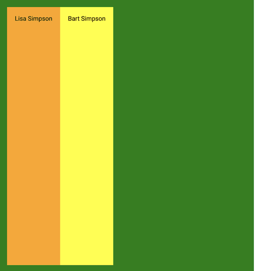
align-items: stretch – align-items: stretch is the default value for this property. All the child containers/flex-items will adjust main axis size based on the contents of the child container but the cross axis will stretch to the size of the parent container. align-items: center
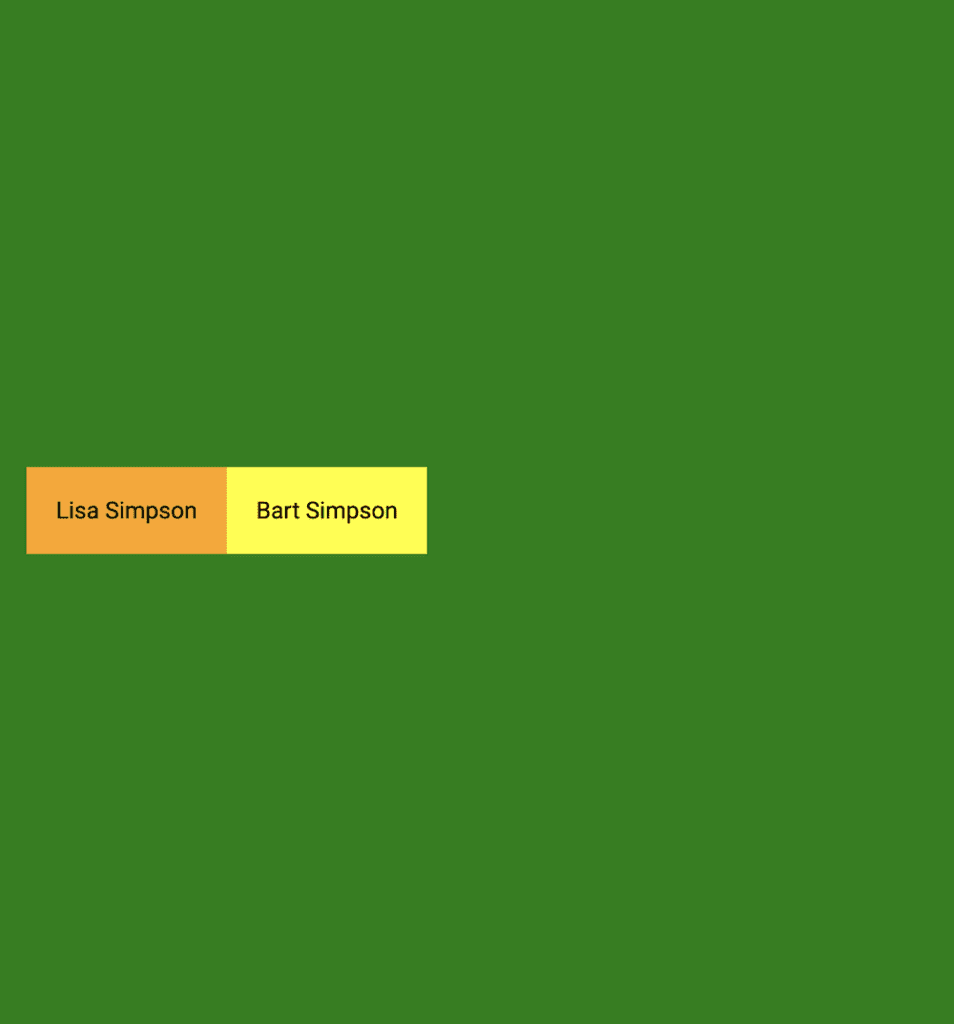
align-items: center – All the child containers/flex-items will adjust main-axis size and cross-axis size based on the contents of the child container and then position itself to the center of the cross-axis. All of the other properties that we went through for justify-content also apply here to align-items and mean the same thing, except that we have just switched which axis we are on.
Child Container (Flex-item) Properties
order
Typically, the order of the containers in a parent component will follow how they are laid out in the HTML file. However, if you would like to control the order of the containers – for instance, if you want to highlight another child container first when you are on a mobile device – you can do that by using the order property. The property is a numerical value that indicates which order the child containers should go in when being displayed on the screen.
align-self
align-self allows for the default alignment or the one set by align-items to be overridden. Remember, align-self only works if the parent itself is display: flex. The values for align-self can be flex-start, flex-end, baseline or stretch.
Conclusion
In this tutorial, we covered the basics of the flexible box model. We discovered that flexbox involves a relationship between the parent container and its child containers. The parent’s flexbox properties directly impact the child containers’ movement in the parent’s free space.
We use flex-direction, justify-content, align-items and flex-wrap to manipulate the child’s position in the parent and we use order and align-self on the child to override some of those defaults or rules put in place on the parent.
Please use the code editors here to play with these properties so you can practice. You are well on your way to becoming a flexbox expert!
About us: Career Karma is a platform designed to help job seekers find, research, and connect with job training programs to advance their careers. Learn about the CK publication.


