Creating animated web elements is an important feature of web design. For instance, you may be designing a button that you want to skew when the user hovers over the button.
That’s where the CSS transform property comes in. The transform property is used to move, rotate, skew, and scale elements on a web page. This allows you to make a web page more interactive for the user.
This tutorial will discuss, with examples, how to work with 2D transforms in CSS using the transform property. At the end of reading this tutorial, you’ll be an expert at using CSS 2D transforms.
CSS 2D Transforms
The CSS transform function allows you to create basic transform animations such as rotations, movements, scales, and skews on a web page.
When an element is transformed, it does not affect any nearby elements. However, a transformed element can overlap them, although it will still take up the space in its default location on a web page.
There are two types of transforms in CSS: 2D and 3D. The transform property is used to create transformations of both types, but for this article we are going to focus on 2D transforms.
There are a number of 2D transformations which can be applied to web elements in CSS. These are:
- translate()
- scale()
- scaleX()
- scaleY()
- skew()
- skewX()
- skewY()
- matrix()
- rotate()
Let’s break down each of these transformations individually, with reference to an example.
translate() Transformation
The translate() method is used to move an element from its current position to a new position on the screen.
The translate() function accepts two parameters: the number of pixels to the right the element should move, and the number of pixels down the element should move.
The syntax for this method is:
translate(xAxis, yAxis);
Suppose we have a box that we want to move 25px to the right and 50px down from its current position. We could accomplish this task using the following code:
index.html

<body>
	<p>This is a paragraph of text.</p>
<div><p>This is a box that has been moved using the translate() method.</p></div>
</body>

styles.css

div {
	transform: translate(25px, 50px);
	background-color: lightblue;
	border: 3px solid black;
}
Our code returns:
[Result of code here]
Let’s break down our code. In our HTML code, we have created two paragraphs of text. The first paragraph appears at the top of the page. The second paragraph appears below the first paragraph and is enclosed within a <div> tag.
In our CSS code, we have defined a style that applies to our <div> tag. This style sets the color of our <div> to light blue, and gives our <div> box a 3px-wide solid black border. In addition, we have also used the translate() transformation to move our box 25px to the left and 50px down.
Here’s our code without a translate() transformation specified:
index.html

<body>
	<p>This is a paragraph of text.</p>
<div><p>This is a box that has been moved using the translate() method.</p></div>
</body>

styles.css

div {
	background-color: lightblue;
	border: 3px solid black;
}
Our code returns:
[Code result here]
As you can see, without specifying a translate() method, our box retains its regular position on the web page.
rotate() Transformation
The rotate() transformation allows you to rotate an element clockwise or counter-clockwise. The extent to which an item is rotated is based on a given degree value.
The syntax for the rotate() transformation is as follows:
transform: rotate(Xdeg);
In the above syntax, X refers to the number of degrees by which you want an element to be rotated. If you want to rotate an element in the clockwise direction, you should specify a positive value for X; otherwise, if you want to rotate an element counter-clockwise, you should specify a negative value for X.
Suppose we have a box that we want to rotate by 45 degrees. We could rotate our box using the following code:
index.html

<div><p>This is a box that has been rotated.</p></div>

styles.css

div {
	transform: rotate(45deg);
	background-color: lightblue;
	border: 3px solid black;
}
Our code returns:

"Career Karma entered my life when I needed it most and quickly helped me match with a bootcamp. Two months after graduating, I found my dream job that aligned with my values and goals in life!"
Venus, Software Engineer at Rockbot
[Code result here]
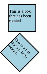
Let’s break down our code. In our HTML code, we have created a <div> box which holds a paragraph of text. In our CSS code, we have applied a light blue background to our box and a 3px-wide solid black border. We also rotate our <div> box by 45 degrees in the clockwise direction.
As you can see in the result of our code, the box we created has been rotated. Here is a comparison of our pre-rotated and post-rotated boxes:

scale() Transformation
The scale() method allows you to increase or decrease the size of an element.
The syntax for the scale() method is as follows:
transform: scale(x, y);
The scale function will proportionally scale the width (x) and height (y) of an image based on the values you specify. If you do not specify a value for the height scale, the scale() function will assume the height scale should be equal to the width scale.
Suppose we have a box that we want to scale to 1.5x its original size. We could do so using this code:
index.html

<div><p>This is a box that has been scaled.</p></div>

styles.css

div {
	transform: scale(1.5, 1.5);
	background-color: lightblue;
	border: 3px solid black;
}
Our code returns:
[Code result here]
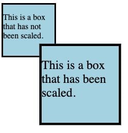
In our HTML code, we have created a box which holds a sentence of text. In our CSS code, we have specified that all <div> tags should have a light blue background and a 3px-wide solid black border. We have also used the scale() method to scale up our box by a factor of 1.5x its original size.

Here is an image comparing the sizes of two boxes. The smallest box has no scale() value, and the largest box has a scale() of 1.5:
The largest box, which includes the text This is a box that has been scaled. is 1.5x as large as our original box.
scaleX() Transformation
The scaleX() transformation allows you to increase or decrease the width of an element. The syntax for the scaleX() transformation is:
transform: scaleX(xValue);
The xValue parameter is the amount by which you want to scale the width of an element. Suppose you have a box whose width you want to increase by a factor of 1.6. You could increase the size of this box using the following code:
index.html

<div><p>This is a box that has been scaled.</p></div>

styles.css

div {
	transform: scaleX(1.5);
	background-color: lightblue;
	border: 3px solid black;
}
Our code returns:
[Code result here]
In this example, the width of our box has been increased by 1.5 times its original width.
scaleY() Transformation
The scaleY() transformation allows you to increase or decrease the height of an element. scaleY() works in the same way as scaleX(), but instead of affecting the width of an element, scaleY() changes the height of the element.
Suppose we wanted to reduce the height of a box to half its current height. We could do so using this code:
index.html

<div><p>This is a box that has been scaled.</p></div>

styles.css

div {
	transform: scaleY(0.5);
	background-color: lightblue;
	border: 3px solid black;
}
Our code returns:
[Code result here]
In our code, we have scaled down the height of our box (which is represented by the y axis) by a factor of 0.5. In other words, our box is half of its original height.
skew() Transformation
The skew() transformation skews an element along its x and y axis by the specified angles.
The syntax for the skew() method is as follows:
transform: skew(xValue, yValue);
xValue refers to how much an element should be skewed on its x axis, and yValue refers to how much an element should be skewed on its y axis. Both values should be represented in degrees.
If a value for yValue is not specified, no skew will be applied on the y axis.
Suppose we want to skew a box by 10 degrees on its x axis and 15 degrees on its y axis. We could do so using this code:
index.html

<div><p>This is a box that has been skewed.</p></div>

styles.css

div {
	transform: skew(10deg, 15deg);
	background-color: lightblue;
	border: 3px solid black;
}
Our code returns:
In this example, we have skewed our box by 10 degrees on the x axis and 15 degrees on the y axis.
skewX() and skewY() Transformations
Like the scale() method, skew() comes with two sub methods which are used to skew an element across either the x or y axis of an element.
To skew an element across its X axis only, you can use the skewX() method. The syntax for this method is as follows:
transform: skewX(xValue);
xValue is the number of degrees on the x axis by which an element should be skewed.
To skew an element across its Y axis, you can use the skewY() method. The syntax for the skewY() method is:
transform: skewY(yValue);
So, if you wanted to skew an element by 10 degrees on its Y axis, you could use this code:
div {
	transform: skewY(10deg);
}
matrix() Transformation
The matrix() transformation performs all of the 2D CSS transformations on an element. So, matrix() can be used to apply translate, rotate, scale, and skew transformations.
The matrix() function accepts six parameters which allow you to apply transformations to an element. The syntax for this method is as follows:
transform: matrix(scaleX(), skewY(), skewX(), scaleY(), translateX(), translateY());
Suppose we wanted to create a box which uses the following transformations:
- A scale on the X axis of 1.
- A skew on the Y axis of 10 degrees.
- A skew on the X axis of 10 degrees.
- A scale on the Y axis of 1.25.
- A movement (“translate”) on the X axis by 25px.
- A movement on the Y axis by 25px.
We could specify each of these transformations individually. However, doing so would result in us having to write many separate transformations. Instead, we can use the matrix() method to write these transformations using one line of code.
Here’s the code we could use to create our box with the aforementioned transformations:
index.html

<div><p>This is a box that has been skewed.</p></div>

styles.css

div {
	transform: matrix(1, 10, 10, 1.25, 25, 25);
	background-color: lightblue;
	border: 3px solid black;
}
Our code returns:
[Code result here]
In our code, we applied a skew, scale, and translate transformation to our box. We accomplished this using the matrix() method and by passing the values we specified earlier.
Conclusion
The transform property is used to apply transformations to an element in CSS. CSS offers a number of 2D transformations, including skew, scale, rotate, and translate, which are used to transform web elements.
This tutorial explored, with reference to examples, the basics of 2D CSS transformations. Now you’re ready to start creating your own 2D transformations like a professional web developer.
About us: Career Karma is a platform designed to help job seekers find, research, and connect with job training programs to advance their careers. Learn about the CK publication.


